PRO—VITAL 05
Poetry of Coding
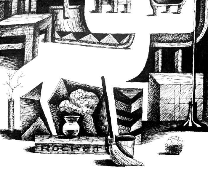
The importance of a negative space, lonelyelk.ru
Once a month is a good practice for any illustrator. Not so much of a pressure to be extremely fast and insanely consistent, but a lot of time and some freedom to experiment within the series of images needed to address the next topic.
This’s the way to work with the author of lonelyelk.ru blog, who writes a strange mix of everyday thoughts and some heavy coding ideas, as his main profession is a programmer. And the number of themes in the blog is broad – starting from ‘Metropolis’ the movie, a newly reconstructed version of which was shown in the Babylon theatre build exactly the same year the film was shot, ending with Liu Cixin’s The Three-Body problem and its enormous perspective on the events of very distant future.
This’s the way to work with the author of lonelyelk.ru blog, who writes a strange mix of everyday thoughts and some heavy coding ideas, as his main profession is a programmer. And the number of themes in the blog is broad – starting from ‘Metropolis’ the movie, a newly reconstructed version of which was shown in the Babylon theatre build exactly the same year the film was shot, ending with Liu Cixin’s The Three-Body problem and its enormous perspective on the events of very distant future.
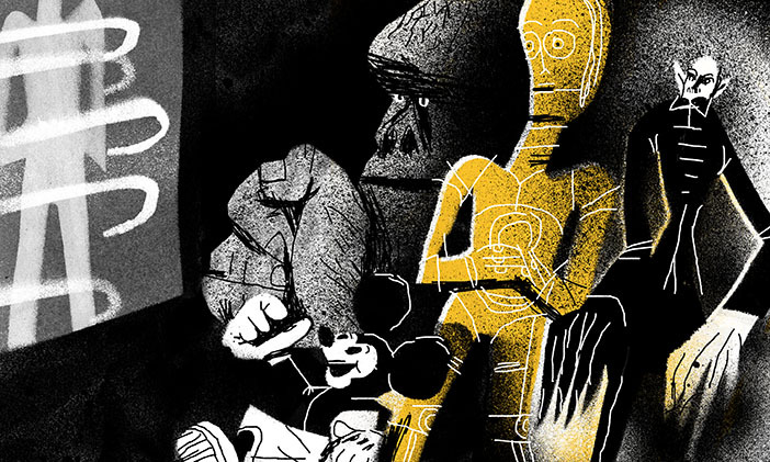
90 years of Metropolis, lonelyelk.ru
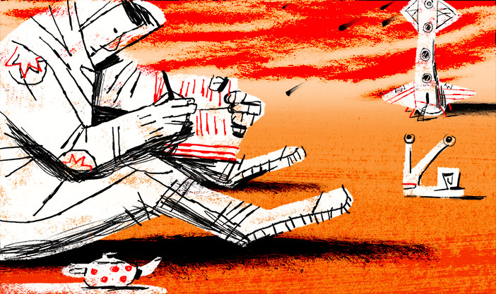 Sci-fi writer, lonelyelk.ru
The editorial appearance of pictures is trying to balance out the speed we produce and consume information these days. Who’s got the time to follow blogs, moreover go and look at the original design of them these days? We used to repost and link and there’s something lost in there, when you look at the same range of pictures placed into some other social media design frames.
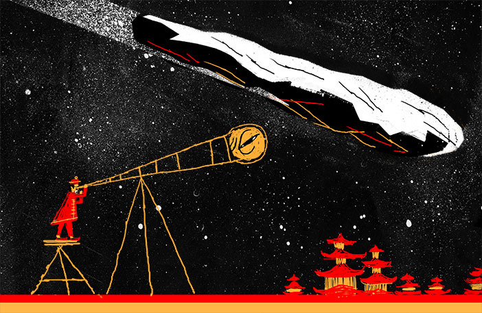
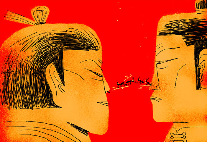
Chinese scale, series of two images, lonelyelk.ru
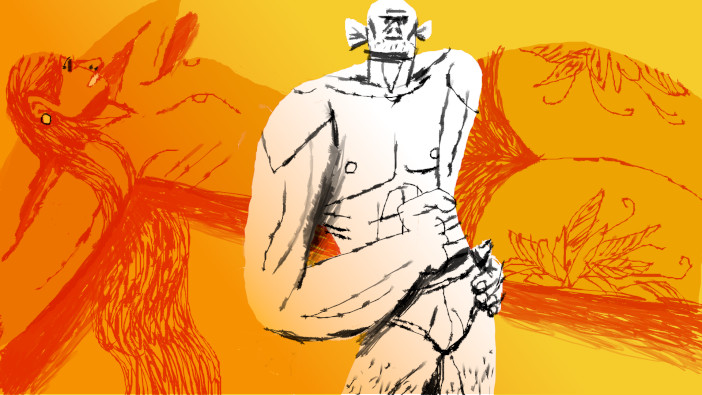
Golden boys, lonelyelk.ru
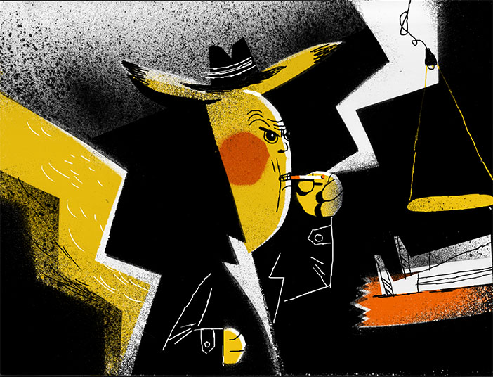
Pikachu-detective, lonelyelk.ru
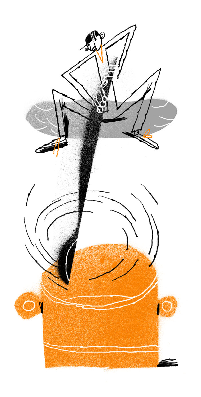
The awareness of the pointles fight with the digital ephemera is liberating. We can keep writing slow texts and draw slow images, that don’t move. They don’t even illustrate the topics directly, most of the times leaving the viewer puzzled.
And this space, this gap left to us by writers and drawers is offering a safe space to relax and reflect, meditate and contemplate.
Working with editorials it’s useful to develop series. Good for the artist too.
![]()
And this space, this gap left to us by writers and drawers is offering a safe space to relax and reflect, meditate and contemplate.
Working with editorials it’s useful to develop series. Good for the artist too.
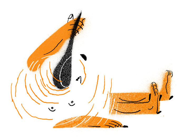
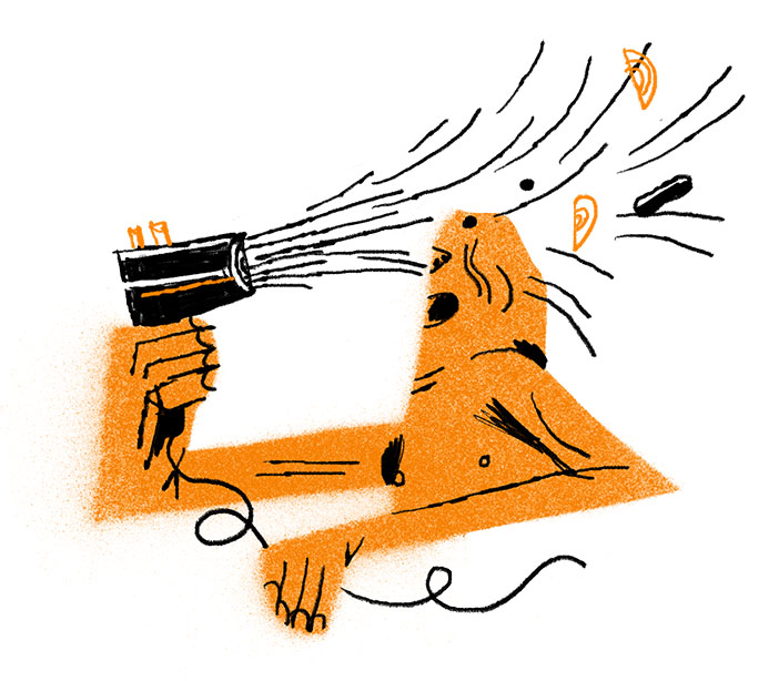
Stir don’t shake, series of three illustrations, lonelyelk.ru
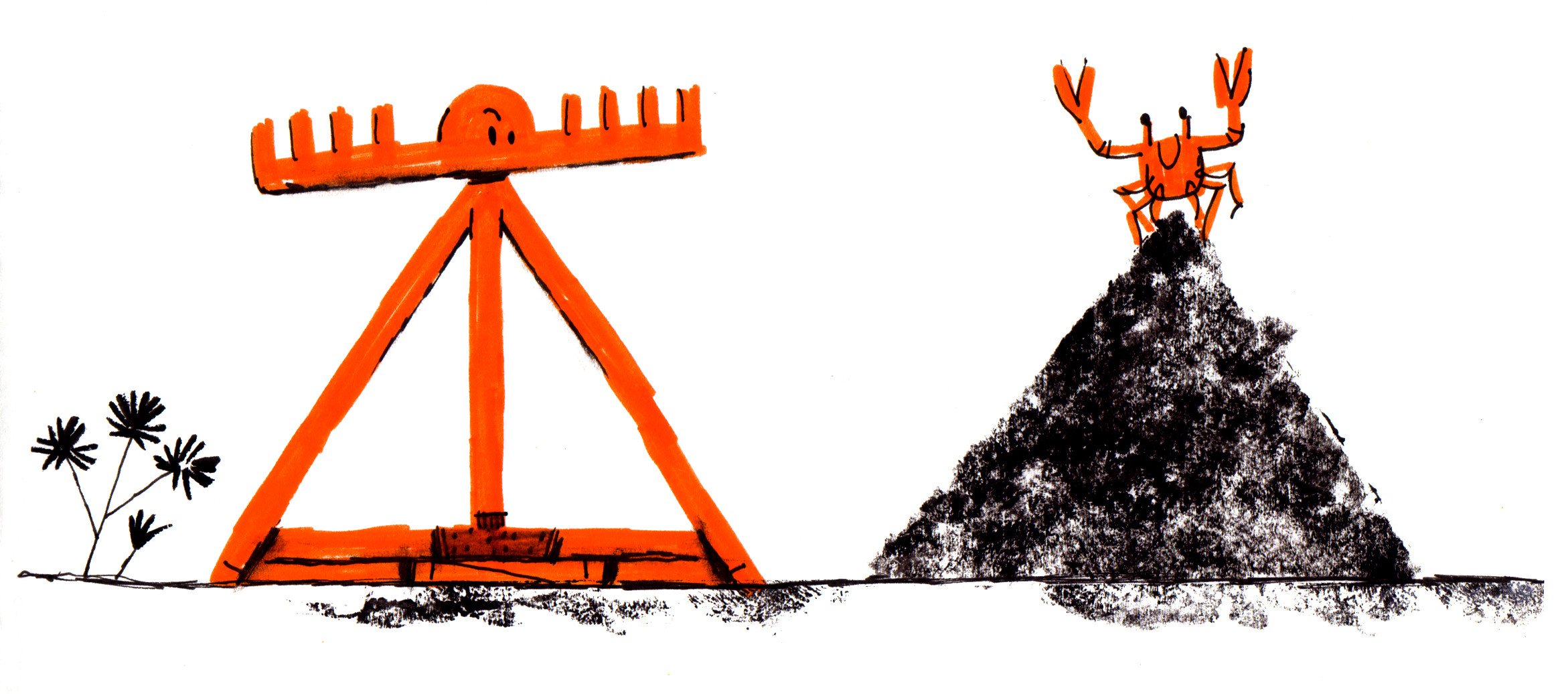

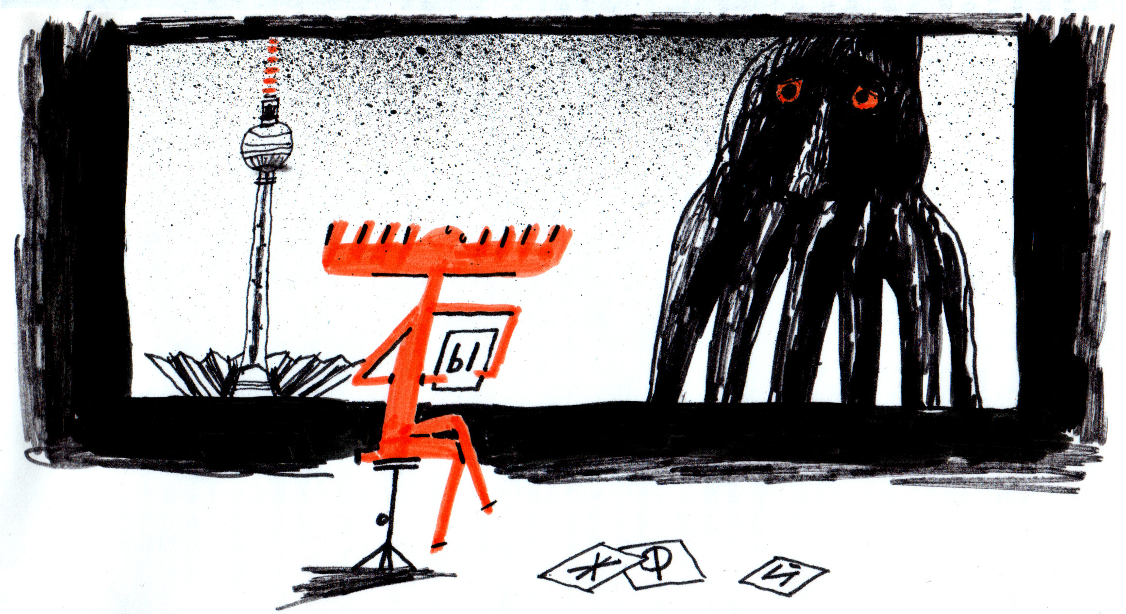
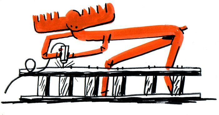
Elk is busy, series of illustrations, lonelyelk.ru